Category Archives: color

The colours associated with the cardinal directions in Chinese, Turkish and Lakota

Today’s blog post will take us to Asia and America, namely to Chinese, Turkish and the Native American Lakota language. All three languages and cultures associate different colours with the four cardinal directions.

Colours associated with the cardinal directions in Chinese

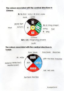
In China, each of the 4 cardinal directions is associated with a colour, as well as an animal and a season. The centre is yellow and is associated with the human realm. The North is associated with the colour black, as well as winter and a turtle  Guī or snake. The South is thought of as red, and its associated animal is the phoenix 凤凰 Fènghuáng and the summer season. The East is associated with the Chinese colour qing 青, which denotes green as well as blue. (See a previous blog post on colour perception in different languages). Its animal is the dragon  lóng and its season is spring. The West is white, and its animal is the tiger   and the season of autumn.

colors/directions in Chinese and Turkish

Colours associated with the cardinal directions in Turkish

Also the Turkish language associates different colours with the four directions. The North is thought of as black (kara), the East is associated with the Turkish colour gök, which is a sky blue or turquoise, the South is seen as red (kızıl, a rusty shade of red) and the West is associated with the colour white (ak). What is interesting in Turkish is that the seas surrounding the Turkish peninsula and Anatolia take their names from these colour associations: the Mediterranean, which is west of Turkey, is called Akdeniz, or the White Sea, the Red Sea is Kızıl Deniz, and is located to the south of Turkey (its name is said to come from the rust-coloured sediments flowing into it) and the Black Sea, or Kara Deniz, is north of Anatolia (the Black Sea is also rich in iron sulfides, where only sulphur bacteria can thrive, and its sediments are dark).

Colours associated with the cardinal directions in Lakota

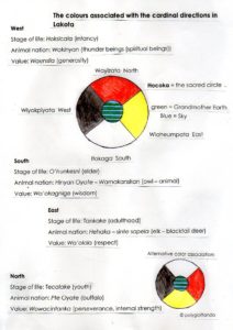
The Native American language Lakota associates not just a different colour with each of the cardinal directions, but each direction also has a value or virtue attributed to it as well as an animal nation, and a stage of life. There are two different systems of colour association, which vary from dialect to dialect. The centre of the sacred circle, or hocoka, is green and blue, the green standing for Grandmother Earth and the blue for the Sky. The North is associated with cold, discomfort and hardship (the direction from which winter comes), the East is associated with the sunrise, the South is the direction from which the sun is strongest, and the West is associated with the sunset and, by extension, the end of life.

colors/directions in Lakota


Focus on art: Indian aesthetic theory (rasas), murti and concepts of art

krishna 576px-Indischer_Maler_um_1710_001

Today’s blog post will take us to India भारत Bharat, and to Indian art, कला kala, and aesthetic theory.

Indian art is based on the ancient aesthetic theory of rasa रस (Sanskrit lit. ‘juice’, ‘extract of a fruit’ or ‘essence’) which, by extension, refers to the finest quality of an object. The term rasa रस  generally refers to the ‘essence’ and emotional qualities crafted into a work of art (or a performance) by the maker and to the response the contemplation or perception of the artwork evokes in the viewer, or sahṛdaya सह्रदय. So it is a viewer-response theory. Rasas are created by bhavas भव (or states of mind). The concept of rasa has its origins in performance theory. Emphasis is therefore always on the spectator, and the artwork or performer only serves as a means for the viewer to experience the different rasas. That is the reason why in Indian paintings and sculpture a narrative mode predominates: a narrative gradually unfolds over the area of a painting or the length of a wall or even building.
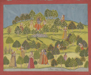
Author: Bodleian Library Oxford

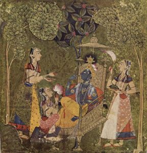
Author: Bodleian Library Oxford; Krishna (with blue complexion and yellow garments) moves through the painting, thereby telling a narrative

The concept of rasa is fundamental to many forms of Indian art, and can be found in dance and performance, music, musical theatre, literature as well as cinema.

The Rasas were first described by Bharata Muni भरत मुनी, an ancient Indian musicologist and theatrologist, in the Nāṭya Śāstra (Sanskrit: नाट्य शास्त्र, Nāṭyaśāstra), a Sanskrit Hindu text on dramatic theory and the performing arts, written between 200 BCE and 200 CE. According to this text, there are 8 original rasas, each of which has an associated deity and a specific colour. Later authors have added a 9th rasa, plus some additional rasas.

  • Shringaram (शृङ्गारं) Love, attractiveness, erotic. Deity: Vishnu. Colour: green; the erotic rasa is blue-black. Considered the ‘king of rasas‘.
  • Hasyam (हास्यं) Laughter, mirth, comedy, comic. Deity: Ganesha. Colour: white.
  • Raudram (रौद्रं) Fury. Deity: Rudra. Colour: red.
  • Kāruṇyam (कारुण्यं) Compassion, tragedy, pathetic. Deity: Yama. Colour: dove-coloured (grey-white).
  • Bībhatasam (बीभत्सं) Disgust, aversion, abhorrent, shocking, odious. Deity: Shiva. Colour: blue
  • Bhayānakam (भयानकं) Horror, terror, fear, terrible. Deity: Kala. Colour: black
  • Vīram (वीरं) Heroic mood. Deity: Indra. Colour: wheatish brown (yellow, ochre)
  • Adbhutam (अद्भुतं) Wonder, amazement, wonderful, wondrous. Deity: Brahma. Colour: yellow
  • The 9th rasa is Śāntam (शांता) Peace or tranquility, quiescent. Deity: Vishnu. Colour: perpetual white (silvery, the colour of the moon and of jasmine)

The 9th Shanta-rasa is simultaneously seen as an equal member of the rasas, but also as distinct, since it represents the clearest form of aesthetic bliss and has been described as “as-good-as but never-equal-to the bliss of Self-realization experienced by yogis”.

In Indian art, the rasas become apparent, for example in the colour in which a certain deity is depicted which hints at the predominant character trait associated with this deity, or in the colour of the aura of a person. For instance, a black aura indicates a frightened person, and a red aura indicates that the character is angry. The god Krishna, who is the archetypal lover and hero, is always depicted with a blue-black complexion and yellow garments.

Two additional rasas appeared later on, in particular in Indian literature. These are:

  • Vātsalya (वात्सल्य) Parental Love
  • Bhakti (भक्ति) Spiritual Devotion

However, a specific deity or colour has not been assigned to these two rasas.
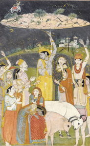
367px-Krishna_Holding_Mount_Govardhan_-_Crop

Another important term in Indian art is Murti (Sanskrit: मूर्ति Mūrti) which usually refers to any solid object that has a definite shape and is made from material elements like wood, stone, pottery or metal. The term murti basically refers to any statue, or to an image or idol of a deity or person, as well as to any incarnation, embodiment, manifestation and appearance of a deity. Murti constrasts with the immaterial world of mind and thought of ancient Indian literature.

Medieval Hindu texts like the Puranas (Sanskrit: पुराण, purāṇa, lit. ‘ancient’, ‘old’), the Agamas (Sanskrit: आगम, lit.’tradition’, from the verb root गम gam meaning ‘to go’ and the preposition आ aa meaning ‘toward’ -> ‘that which has come down’) and the Samhitas (Sanskrit: संहिता, saṁhitā, lit. ‘put together, joined, union’) described the proper proportions, positions and gestures (mudra) for the murti.

The expressions in a Murti vary, but there are two major categories in Hindu iconography:

  • Raudra रौद्र (lit. dire) or Ugra उग्र (lit. fierce, violent, furious) symbolism – used to express fear, violence and destruction (deities: Kali, Durga). Typical elements include adornment with skulls and bones, weapons, and wide, circular eyes.  Raudra deity temples were invariably located outside of villages or towns, and in remote areas of a kingdom. Ugra images were worshipped by soldiers before going to war, or by people in times of distress.
  • Shanta शांता (lit. peaceful) and Saumya सौम्या (lit. gentle, benign, kind) symbolism – used to express joy, love, compassion, kindness, knowledge, harmony and peace (deities: Lakshmi, Saraswati). These temples were predominantly located inside towns and villages. Saumya images symbolize peace, sensuality, knowledge, music, wealth, flowers, etc.

Apart from anthropomorphic murti, some Hindu traditions prefer aniconism, that is the absence of figurative representations of the natural or supernatural world. Here the murti take the shape of the linga for Shiva, the yoni for Devi, and the shaligrama for Vishnu.

A murti may be found inside or outside homes as well as temples, and in some cases it can just be a landmark. A murti is often considered as an embodiment of the divine or Brahman, and may be treated as a welcome guest in homes and serve as a participant in Puja rituals.

The artist, कलाकार kalakar, or artisan who makes any works of art or crafts, including murti, is known as Shilpin शिल्पिन्, (for a male artist) or Shilpini शिल्पिनी (for a female artist). The Shilpins design the murti according to the rules of canonical manuals like the Agamas and the Shilpa Shastras. The term Shilpa Shastras (Sanskrit: शिल्प शास्त्र śilpa śāstra) literally means the Science or Discipline of the Shilpa (i.e. the arts and crafts). Shilpa शिल्प refers to any art or craft, while Shastra शास्त्र means ‘iconography’, ‘a work of scripture’ or ‘discipline’. Man-made works of art are termed Shilpani शिल्पनि. The Shilpa Shastra is an umbrella term for various Hindu treatises and manuals on the arts and crafts, which outline Hindu iconography, design principles and rules, composition, the ideal proportions for human sculptures, as well as the principles and rules of architecture.

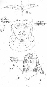
Indian_murti_(statue)_proportions_posture_shape_design_05Indian_murti_(statue)_proportions_posture_shape_design_06Indian_murti_(statue)_proportions_posture_shape_design_10

The Brihat Samhita बृहत् संहिता (lit. ‘Large Codex’), a 6th-century encyclopedia covering a wide range of topics from astrology to horticulture to murti and temple design, and the 6th-century treatise  Manasara-Shilpashastra मनसारा शिल्पशास्त्र (literally: ‘treatise on art using the method of measurement’), specify 9 materials that can be used for the creation of murti: stone पत्थर patthar, wood लकड़ी lakadee, copper तांबा taamba, gold सोना sona, silver चांदी chaandee, earth (= clay मिट्टी mittee or terracotta टेरकोटा), sudha सुधा (a type of mortar plaster or stucco), sarkara सरकार (gravel, grit), and abhasa आभास (various types of marble or stones, which have a range of colours and opacity). Metal murti are often made from a special alloy called panchaloha, which is believed to have auspicious properties and is considered of sacred significance. Panchaloha (Sanskrit: पञ्चलोह), which is also known as Panchadhatu (Sanskrit: पञ्चधातु, lit. ‘five metals’), is an alloy consisting of 5 metals, namely gold (Au), silver (Ag), copper (Cu) iron (Fe) and lead (Pb); the lead is often replaced by tin (Sn) or zinc (Zn).
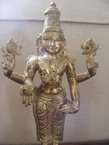
Author: +rex, via Wikipedia Commons, a Panchaloha Murti (a metal alloy made of 5 elements)

Author: +rex, via Wikipedia Commons, a Panchaloha Murti (a metal alloy made of 5 elements)

References: Indian Art, by Vidya Dehejia, Phaidon Press, London, 1997

https://en.wikipedia.org/wiki/Indian_aesthetics

https://en.wikipedia.org/wiki/Shilpa_Shastras

https://en.wikipedia.org/wiki/Murti

Colour perception in various languages

nepal-1321663_960_720

Today’s blog post will be about colour perception in different cultures and languages around the world.

The terms for colours cannot always be translated in a straightforward manner since some colours, esp. green and blue (“grue”) in some Asian languages, are often perceived differently from those in the West, and are considered separate colours in those countries whereas in English there is just one term for both shades or vice versa.

Russian

In Russian, there are two different terms for blue which are considered as separate colours and not just as shades of the same colour as in English: голубой (‘goluboy’) light blue and  синий (‘siniy’) dark blue.

Hungarian

In Hungarian, there are two separate terms for red: piros is a bright red and vörös is a dark red.

German

In German, there are two different terms for pink: Pink is the same bright saturated shade as in English, but when the colour is pale pink it is called rosa.

‘Grue’ or green and blue in various Asian languages

The origin of the perception of a green-blue (‘grue’) colour, which in English is called ‘teal’ or is seen as two separate colours (blue and green), comes from the Chinese character 青 (qīng).

The colour qīng 青 can mean either of the colours that in English are referred to as ‘green’, ‘blue’, or ‘black’, depending on the context and the nouns or fixed phrases it is used with. To give an example, qing means ‘blue’ when used with ‘sky’ 青天 (qīngtiān) or ‘eyes’青眼 (qīngyǎn) , but ‘black’ when used with ‘hair’ 青丝(qīngsī) and ‘green’ when used with the character for ‘mountain’ 青山 (qīngshān), ‘grass’青草 (qīngcǎo)  or ‘vegetables’ 青菜 (qīngcài).

Qing  , according to tradition, is the colour of things that are born and the term 青春 (qīngchūn ‘green spring’) means youth. This is connected to its meaning ‘black’ since young people in China have dark hair, or 青鬓 (qīng bìn) ‘black temple hair’, an idiom referring to young people. Qing can also refer to black clothes or fabrics and one of the main female roles in Chinese opera, 青衣 (qīngyī), refers to the fact that most actors wear black clothing.

Qing can also refer to the colour ‘blue’, which originates from the dye bluegrass which in ancient times was used to dye things in the colour of qing. The idiom 出於藍,而勝於藍青出于蓝,而胜于蓝 (qīngchūyúlán ér shèng yú lán, ‘blue comes from the indigo plant but is bluer than the plant itself’) describes how a student could come to excel their teacher.

The character 青qing originally derives from the components for 生 ‎’growth of plants‘ and 丹 ‎’cinnabar‘, which was also used for dyeing and by extension came to refer to ‘colour’ in general, so 青qing came to be known as the ‘colour of growing plants’ and green-blue, and came to describe a range of colours from light green through blue to deep black 玄青 (xuánqīng). Over time, the character for cinnabar was exchanged with the similar character for ‘moon’月.

The modern Mandarin Chinese language, however, also has the blue–green distinction with 蓝/ 藍 lán for blue and 绿 / 綠 for green. Another peculiarity of Chinese colour perception is the case of ‘red’ / , hóng and ‘pink’ 粉红, fěn hóng (lit.’powder red’), which are considered varieties of a single colour.

青 qing (Cantonese 廣東話 )

In Cantonese, qing 青 can describe the same range of colours as in Mandarin Chinese. It means ‘green’ when referring to grass, plants or the mountains, ‘blue’ when referring to the sky or stones, and ‘black’ or ‘young’ when referring to hair or fabrics. However, in Cantonese (廣東話), 青 qing meaning ‘black’ is still used in contexts where the use of  黑 would be inauspicious since it is a homophone of ‘乞’ (beggar), for example 黑衣, ‘black clothes’, would also mean ‘beggar’s clothes’.

Vietnamese

Vietnamese has taken over the green-blue colour perception from the ancient Chinese character and is read as xanh, which can mean both ‘green’ or ‘blue’ depending on the context. To specify which shade exactly you mean, you have to add some descriptive terms, so xanh da trời means ‘blue as the sky’, xanh dương or xanh nước biển means ‘blue as the ocean’ and xanh lá cây means ‘green like the leaves’. Vietnamese sometimes uses the terms xanh lam for blue and xanh lục for green, which derive from the Chinese characters 藍and 綠 respectively.


Japanese

Also Japanese has the colour green-blue, or ao ‎(hiragana あお, romaji ao, historical hiragana あを), which also derives from the ancient Chinese character and its connotations. So ao can mean ‘blue’, ‘green’ or ‘black’ depending on the context. In the case of Japanese, the colour connotation ‘black’ comes from the bluish-black colour of a horse’s hair. Ao is also used in particular to refer to the green of traffic lights and to the colour of plant leaves, vegetables and apples. By contrast, other ‘green’ objects will generally be referred to as being midori, e.g. clothes, cars, etc.

Lakota

Also in the native American language Lakota (‘Sioux’), one word is used for both blue and green, namely the term tȟó. However, a term for ‘green’ – tȟózi- has come into use, which is made up of the terms  tȟó meaning ‘blue-green’ and meaning ‘yellow’. In the same way,  zíša/šázi refers to the colour orange, šá on its own meaning ‘red’. The colour purple or violet is thus šátȟo/tȟóša.


Some interesting links for further reading on the topic:

https://en.wikipedia.org/wiki/Blue%E2%80%93green_distinction_in_language

http://www.theworldofchinese.com/2013/06/what-color-is-qing/

https://en.wiktionary.org/wiki/%E9%9D%92

Does your language also have a different colour perception from the English one? Let us know in the comments!! 🙂